Seemannsgarn
Um Käpt'n Karl spinnen sich viele Legenden, nicht eine davon ist wahr. Die ganze Wahrheit wäre auch schlicht viel zu uninteressant. Deshalb spinnen wir hier am Seemannsgarn. Viel Spaß beim Lesen. Und ein Funken Wahrheit ist -wie immer- natürlich doch dabei.
Seemannsgarn
- Details
With a new and improved template parameters we have combined some of the most used and asked for features within an easy to use and beautifully styles interface. With these parameters you can now quickly customise your template to your own needs and have your site up and running in a matter of minutes.
Your template parameters can be access directly from your Template Manager giving you access to a host of features including a selection of template styles, some colour choosers to help customise your template headers and links, a number of layout options and easy to use logo settings.
- Details
Vivamus sit amet ante est, sit amet rutrum augue. Praesent laoreet aliquet nulla. Aliquam arcu. Proin vel neque non ligula sodales sagittis. Cum sociis natoque penatibus et magnis dis parturient montes, nascetur ridiculus mus.
Duis autem vel eum iriure dolor in hendrerit in vulputate velit esse molestie consequat, vel illum dolore eu feugiat nulla facilisis at vero eros et accumsan et iusto odio dignissim qui blandit praesent luptatum zzril delenit augue duis dolore te feugait nulla facilisi. Cras non sem sem, at eleifend mi.
- Details
There is a total of 56 available module positions all of which are fully collapsible. By default your module widths will automatically adjust depending on the number of modules published within its containing row however within the templates parameters you can disable this feature and customise the width of each individual module.
- Details
There is a total of 6 color styles available giving your the template flexibility in match the color scheme best suited to your needs. Color styles available are Black, Red, Blue, Green, Bronze and Purple and can be set by navigating to your templates parameters (Extensions -> Template Manager -> J51 [Template Name] and simply selecting the color style of your choice from the 'Template Style' dropdown menu.

- Details
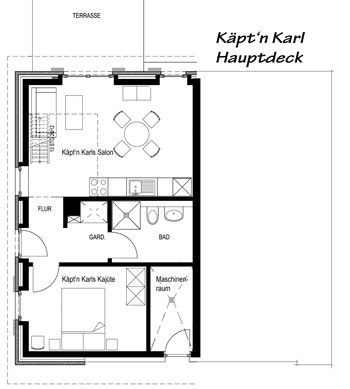
Herzlich Willkommen in der Kajüte von Käpt'n Karl.
Karl hat 52 qm Platz. Der Salon mit Chaisse longue, Kartentisch und gut ausgestatteter Kombüse liegt nach Süd-West. Ein LCD-Satelliten-Bildschirm für die Küstennachrichten und bei Bedarf Bordfunk (W-LAN) stehen zur Verfügung.
In der Schlaf-Kajüte steht eine Koje mit französischen Ausmaßen von 1,60 m auf 2,00 m
Karl hat auch ein barrierefreies Duschbad.
Die Stiege im Salon führt auf Käpt'n Karls Brücke.
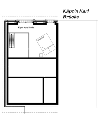
Auf der Brücke gibt es die beste Aussicht zum Festland zu und bis zum Peenestrom. Hier sieht man oft die weißen Segel der Yachten. Möglich ist auch ein Lager für die zwei wachhabenden Matrosen auf einem komfortablen Faltbett.
Die Kajüte von Käpt'n Karl hat eine schalldichte Verbindungstüre zu Major Tom. Wenn Ihr beide Kajüten zusammen chartern wollt, kontaktiert mich gerne.
Hier einige Photos zum wunderbaren Ambiente.


- Details
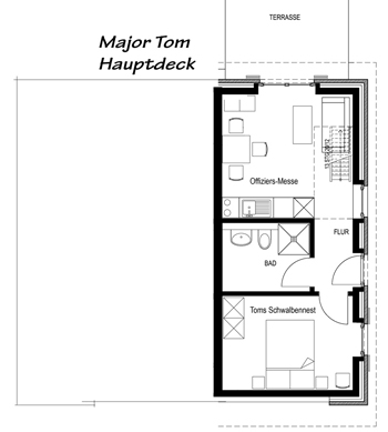
Herzlich Willkommen in der Kajüte von Major Tom.
Toms Kajüte ist 42 qm groß. Die Offiziersmesse mit Chaisse longue und gut ausgestatteter Kombüse liegt nach Süd-West. Ein LCD-Satelliten-Bildschirm für den Seewetterbericht und bei Bedarf Bordfunk (W-LAN) stehen zur Verfügung.
Zur Kajüte gehört noch das Schwalbennest mit einem französischen Bett von 1,60 m Breite und ein barrierefreies Duschbad.
Die Stiege in der Messe führt auf Major Toms Brücke.
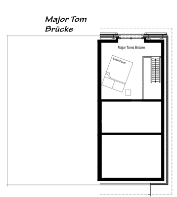
Oben gibt es dann die beste Aussicht und ein Lager für zwei Leichtmatrosen auf einem komfortablen Klappbett.
Major Tom hat in der Offiziersmesse eine schalldichte Verbindungstür zu Käpt'n Karl. Wenn Ihr beide Kajüten gemeinsam chartern wollt, nehmt gerne Kontakt mit mir auf.
Hier einige Photos zum wunderbaren Ambiente.


- Details
Usedom liegt im Norden Deutschlands ganz im Osten. Auf der Insel verläuft die Grenze zu Polen, auf der polnischen Seite heißt die Insel Wolin.
Usedom ist aus Nord- und Mitteldeutschland und aus Dänemark sehr gut zu erreichen. Man reist mit dem Auto über Berlin oder über Hannover, Hamburg, Lübeck und Rostock an. Mit der Bahn kommt man gut bis Greifswald oder Pasewalk (alles weitere zieht sich), mit dem Flieger nach Rostock oder direkt nach Heringsdorf auf Usedom. Von dort macht ein Leihwagen Sinn.
In guter Entfernung (40 Minuten mit dem PKW) der Insel liegt die Universitäts- und Hansestadt Greifswald. Die Hansestadt Stralsund liegt an der Zufahrt zur Insel Rügen. Usedom liegt im Landkreis Vorpommern-Greifswald (VG, vorher OVP). In Anklam berührt der Peene-Strom das Stettiner Haff und erreicht zwischen dem Festland und der Insel schließlich die Ostsee.
Die Insel Usedom hat sich zu den schönsten Feriengebieten Deutschlands entwickelt. Inzwischen hat sich auch im Ausland herumgesprochen, dass auf Usedom anspruchsvolle Ferien in landschaftlich herrlicher Umgebung möglich sind.
Dem Urlauber bieten sich mehr als 400 km ausgeschilderten Wander- und Fahrradwege auf der zweitgrößten Insel Deutschlands. Landschaftlich begeistert der 40 km lange, weiße und steinfreie Sandstrand, der angrenzendem Küstenwald und weites hügeliges Land mit ausgedehnten Wiesen, Wäldern, Buchten und Seen. In Karlshagen nähert sich im Westen die Peene, in deren Binnenhafen Kutter, Ausflugsschiffe und Freizeitkapitäne festmachen. Etwa 85% der Insel stehen unter Naturschutz.
- Details
Die Ferienwohnungen (Kajüten) Käpt'n Karl und Major Tom sind Kleinode für erholsame Ferientage. Kurzurlauber mit Interesse an Kultur, Naturerholung und hoher Unterbringungsqualität finden hier einen Ort zum Auftanken. Absolute Ruhe und der Blick über die Peene-Auen bis zum Peenestrom mit der Wolgaster Kirche im Hintergrund sind Garanten für Erholung. Die Ostsee mit ihrer sauberen, heilsamen Luft lädt zu Strandspaziergängen und natürlich auch zum Baden ein. Ergänzt wird das Angebot von interessanten kulturellen Events und Ausflugsmöglichkeiten in der Umgebung.
Geeignet sind beide Kajüten für zwei Erwachsene und ein bis zwei mitreisende Kinder (Leichtmatrosen).

Der Peene-Hafen und die Marina Karlshagen liegt in 500 m Entfernung. Am Hafen gibt es jederzeit frischen und geräucherten Fisch, eine hochwertige Gastronomie lädt zum Genießen ein. Und die Ostsee ist in rund 1.700 m Entfernung auch gut erreichbar, zumal wenn man sich bei einer der gut ausgestatteten Verleihstationen ein Fahrrad oder Pedelec ausleiht. Die Randlage direkt am Naturschutzgebiet Peene-Auen mit dem direkten Zugang zu den eingedeichten Feuchtwiesen erlaubt direkte Spaziergänge und Radtouren vom Liegeplatz in die Natur.

Dazu kommt die Erkenntnis, dass der Ostseeraum, hier vor allem der Greifswalder Bodden die pollenärmste Region Deutschlands ist. Käpt'n Karl und Major Tom sind weitgehend allergievermeidend ausgebaut und bieten auch für Allergiker ein ungestörtes, gesundes Urlaubserlebnis. Damit das so bleibt, bitten wir unsere Gäste allerdings auch, an Bord nicht zu rauchen und keine Tiere mitzubringen.
NICHTRAUCHER | NUR SEEHUNDE ERLAUBT
Die Beiden Kajüten lassen sich auch miteinander verbinden. Wenn Sie das wünschen, reservieren Sie bitte beide Kajüten zum gleichen Zeitraum und teilen Sie mir den Wunsch zur gemeinsamen Fahrt mit.

Weiterhin sind die Kajüten barrierearm und erlauben ungehinderte Ferien für Jedermann, speziell für Senioren oder auch Menschen mit Handicap. Spezielle Vereinbarungen dazu verabreden Sie gerne über meine Kontaktseite mit mir.
Die Preise gelten für die Buchung mit zwei Personen. Für die 3. und 4. Person (Kinder) berechne ich einen Energie und Nebenkostenaufschlag von 2,00 EUR pro Person und Tag.
Babyreisebett (Faltboot) und Trip-Trap-Kinderstuhl stehen für kleine Leichtmatrosen für 5,00 EUR/Woche ebenfalls zur Vefügung.
Für die Benutzung des Bordfunks (W-Lan) berechne ich 1,00 EUR pro Tag. Diese erstatte ich, wenn Sie mir ein paar nette Zeilen in unser Logbuch oder auf facebook schreiben.
Bitte geben Sie bei der Buchung an, wenn Sie bestimmtes Zubehör mitbuchen möchten. Vielen Dank.
Sie finden uns auch auf: Ferienhaus Usedom / Touristonline Usedom / exklusiv-usedom.de / ferienhausmiete.de
Der Gesetzgeber und die oberste Rechtsprechung haben verordnet, dass auf dieser Seite die Preise incl. aller Endpreise pro Nacht ausgewiesen werden müssen. Ich habe deshalb Musterberechnungen für den vermutlich günstigsten und teuersten Aufenthalt ermittelt. Den exakten Preis rechnet das Buchungsportal aus. Wenn es dann zu teuer ist, bitte den Buchungs-Vorgang abbrechen. Die Tabelle kann besser lesbar als PDF heruntergeladen werden: einfach anklicken.
Jetzt für den nächsten Sommer buchen: auch 2024 gibt es 10% Nachlass, wenn Du 10 Nächte oder länger an Bord gehst.
- Details
We have included an option to easily add animations to almost any element of your site content. These animations are triggered once elements enter the viewport of your browser as you scroll down the page adding life and energy to your site content. Great for adding focus to particular elements of your content which you wish to bring to the attention of your visitors.
Doing so is as simple as adding class names to the element you wish to animate via either inline through your editor or via your Module Class Suffix (Modules) or Link CSS Style (Menu Items) fields.
- Details
Aktuelle Veranstaltungen in Karlshagen ....
Karlshagen Panorama zum betrachten. Die besten Eindrücke 360° vorab ....
- Details
Die Landschaft, die Küste und die kleinen oder größeren Orte bieten vielfältige Aus- und Ansichten. Lasst Euch inspirieren.
- Details
Font Awesome is a pictographic language of web-related actions which delivers over 300 icons. The Font Awesome webfont and CSS files are licensed under CC BY 3.0 and you can find the full examples of usage at Font Awesome - https://fontawesome.com/v4.7.0/icons/
Add class fa-CLASS_NAME to any element, best used with a <span>.
Can also be added to any menu item using the Link CSS Style field in your menu item settings or to a module title using the Header Class field in your module settings.
New Icons in Font Awesome4.2
Web Application Icons
Form Control Icons
Currency Icons
Text Editor Icons
Directional Icons
Video Player Icons
Brand Icons
Medical Icons
- Details
A utility class is a class that defines a set of methods that perform common, often re-used functions. Your template includes a number of helpful utility classes to help style your content. In Joomla there is a number of different methods of adding a class name to an element..
Inline Styling
The most basic method is inline directly in to the HTML of your document. Note that this method is only used when your are viewing the HTML source of your document either via the CodeMirror editor or the source/HTML option available in most other editors. An example would look something like the following....
<h2 class="padding-bottom-40">
    A Sample Heading
</h2>
The above class name of padding-bottom-40 will add a padding (space) of 40px to the bottom of the text.
Module Class Suffix (Module)
This method is specific to modules. If you click in to the settings of any module and select the 'Advanced' tab you will notice a 'Module Class Suffix' field. Simply add the utility class to apply the CSS of this class to the enitre module. An popular example would be the utility class 'text-light' which will convert all the text within a module to white which you will find useful if you have a dark background image or color set for the module area background. Note you can add as many classes as you like by simply separating them with a space.
Link CSS Style (Menu Items)
This final method is specific to menu items. Clicking in to the settings of any menu item (Menus -> [YourMenu] -> [YourMenuItem]) and selecting the 'Link Type' you will notice a 'Link CSS Style' field. This will allow you to apply a class to that particular menu item.
Text/Icons Color Classes
| Class | CSS Property |
|---|---|
| text-light | All containing text/icons is light |
| text-dark | All containing text/icons is dark |
Padding & Margin Classes
| Class | CSS Property |
|---|---|
| padding-top-0 | padding-top: 0px; |
| padding-top-5 | padding-top: 5px; |
| padding-top-10 | padding-top: 10px; |
| padding-top-15 | padding-top: 15px; |
| padding-top-20 | padding-top: 20px; |
| padding-top-30 | padding-top: 30px; |
| padding-top-40 | padding-top: 40px; |
| padding-top-60 | padding-top: 60px; |
| padding-bottom-0 | padding-bottom: 0px; |
| padding-bottom-5 | padding-bottom: 5px; |
| padding-bottom-10 | padding-bottom: 10px; |
| padding-bottom-15 | padding-bottom: 15px; |
| padding-bottom-20 | padding-bottom: 20px; |
| padding-bottom-30 | padding-bottom: 30px; |
| padding-bottom-40 | padding-bottom: 40px; |
| padding-bottom-60 | padding-bottom: 60px; |
| padding-horiz-10 | padding: 0 10px; |
| padding-horiz-20 | padding: 0 20px; |
| padding-horiz-30 | padding: 0 30px; |
| padding-horiz-40 | padding: 0 40px; |
| padding-horiz-60 | padding: 0 60px; |
| padding-vert-10 | padding: 10px 0; |
| padding-vert-20 | padding: 20px 0; |
| padding-vert-30 | padding: 30px 0; |
| padding-vert-40 | padding: 40px 0; |
| padding-vert-60 | padding: 60px 0; |
| Class | CSS Property |
|---|---|
| margin-top-0 | margin-top: 0; |
| margin-top-5 | margin-top: 5; |
| margin-top-10 | margin-top: 10; |
| margin-top-15 | margin-top: 15; |
| margin-top-20 | margin-top: 20; |
| margin-top-30 | margin-top: 30; |
| margin-top-40 | margin-top: 40; |
| margin-top-60 | margin-top: 60; |
| margin-bottom-0 | margin-bottom: 0; |
| margin-bottom-5 | margin-bottom: 5; |
| margin-bottom-10 | margin-bottom: 10; |
| margin-bottom-15 | margin-bottom: 15; |
| margin-bottom-20 | margin-bottom: 20; |
| margin-bottom-30 | margin-bottom: 30; |
| margin-bottom-40 | margin-bottom: 40; |
| margin-bottom-60 | margin-bottom: 60; |
| margin-horiz-10 | margin: 0 10px; |
| margin-horiz-20 | margin: 0 20px; |
| margin-horiz-30 | margin: 0 30px; |
| margin-horiz-40 | margin: 0 40px; |
| margin-horiz-60 | margin: 0 60px; |
| margin-vert-10 | margin: 10px 0; |
| margin-vert-20 | margin: 20px 0; |
| margin-vert-30 | margin: 30px 0; |
| margin-vert-40 | margin: 40px 0; |
| margin-vert-60 | margin: 60px 0; |
Background Color Classes
| Class | CSS Property | Color |
|---|---|---|
| background-white | color: #FFFFFF; | |
| background-black | color: #000000; | |
| background-gray | color: #888888; |
| Class | CSS Property | Color |
|---|---|---|
| background-gray-dark | color: #333333; | |
| background-gray-light | color: #cccccc; | |
| background-gray-lighter | color: #ebebeb; |
If you like this feature please let us know in our forums and we will extend on this in future template releases!
- Details
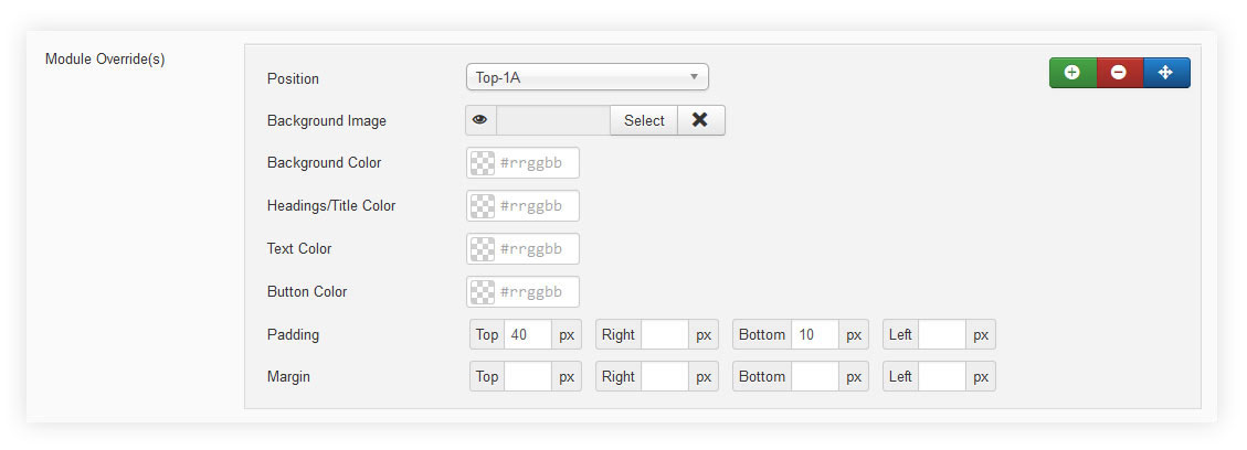
Module Style Overrides allow you to style individual module positions to your own taste. This greatly extends the control of how each of your module positions are displayed with a host of styling options including background image, background color, text color, heading color, button color and module padding. Multiple overrides can be created, each applied to the module position of your choice. Any module position with no override applied will continue to use the default template styling.
- Details
Heading1 (h1) looks like this
Lorem ipsum dolor sit amet, consectetuer adipiscing elit, sed diam nonummy nibh euismod tincidunt ut laoreet dolore magna aliquam erat volutpat. Ut wisi enim ad minim veniam, quis nostrud exerci tation ullamcorper suscipit lobortis nisl ut aliquip ex.
Heading2 (h2) looks like this
Lorem ipsum dolor sit amet, consectetuer adipiscing elit, sed diam nonummy nibh euismod tincidunt ut laoreet dolore magna aliquam erat volutpat. Ut wisi enim ad minim veniam, quis nostrud exerci tation ullamcorper suscipit lobortis nisl ut aliquip ex.
Heading3 (h3) looks like this
Lorem ipsum dolor sit amet, consectetuer adipiscing elit, sed diam nonummy nibh euismod tincidunt ut laoreet dolore magna aliquam erat volutpat. Ut wisi enim ad minim veniam, quis nostrud exerci tation ullamcorper suscipit lobortis nisl ut aliquip ex.
Heading4 (h4) looks like this
Lorem ipsum dolor sit amet, consectetuer adipiscing elit, sed diam nonummy nibh euismod tincidunt ut laoreet dolore magna aliquam erat volutpat. Ut wisi enim ad minim veniam, quis nostrud exerci tation ullamcorper suscipit lobortis nisl ut aliquip ex.
Heading5 (h5) looks like this
Lorem ipsum dolor sit amet, consectetuer adipiscing elit, sed diam nonummy nibh euismod tincidunt ut laoreet dolore magna aliquam erat volutpat. Ut wisi enim ad minim veniam, quis nostrud exerci tation ullamcorper suscipit lobortis nisl ut aliquip ex.
<pre> or <div class="code">
To display note use: <p class="note">Sample of your note !</p>
To display pin note use :<p class="pin">Sample of your pin note !</p>
To display clip note use:<p class="clip">Sample of your clip note</p>
To display download note use:<p class="down">Sample of your download note</p>
Text Formats
This is <strong>strong text</strong>
This is strong text
This is <em>emphasized text</em>
This is emphasized text
This is <u>underlined text</u>
This is underlined text
This is <s>strikethrough text</s>
This is strikethrough text
This is <a>link text</a>
This is link text
This is <small>small text</small>
This is small text
This is <sup>superscript text</sup>
This is superscript text
This is <sub>subscript text</sub>
This is subscript text
This is <samp>sample text</samp>
This is sample text
This is <var>variable text</var>
This is variable text
This is <kbd>keyboard text</kbd>
This is keyboard text
This is <abbr>abbreviation text</abbr>
This is abbreviation text
This is <del>deleted text</del>
This is deleted text
This is <ins>inserted text</ins>
This is inserted text
This is <mark>marked text</mark>
This is marked text
Ordered List
- Lorem ipsum dolor sit amet consectetur
- Lorem ipsum dolor sit amet consectetur
- Lorem ipsum dolor sit amet consectetur
Un-Ordered List
- Lorem ipsum dolor sit amet consectetur
- Lorem ipsum dolor sit amet consectetur
- Lorem ipsum dolor sit amet consectetur
Un-Ordered List witch class="tick"
<ul class="tick"><li>Your list item goes here!</li></ul>
- Lorem ipsum dolor sit amet consectetur
- Lorem ipsum dolor sit amet consectetur
- Lorem ipsum dolor sit amet consectetur
Un-Ordered List witch class="star"
<ul class="star"><li>Your list item goes here!</li></ul>
- Lorem ipsum dolor sit amet consectetur
- Lorem ipsum dolor sit amet consectetur
- Lorem ipsum dolor sit amet consectetur
Un-Ordered List witch class="plus"
<ul class="plus"><li>Your list item goes here!</li></ul>
- Lorem ipsum dolor sit amet consectetur
- Lorem ipsum dolor sit amet consectetur
- Lorem ipsum dolor sit amet consectetur
Horizontal Rules
<hr>
<hr class="center">
<hr class="right">
Blockquote
<blockquote><p>Your list item goes here!</p></blockquote>
Lorem ipsum dolor sit amet, consectetuer adipiscing elit, sed diam nonummy nibh euismod tincidunt ut laoreet dolore magna aliquam erat volutpat.
Emphasis Tags
<em class="highlight black">your text</em>
An emphasis tag that allows you to highlight some text in black.
<em class="highlight blue">your text</em>
An emphasis tag that allows you to highlight some text in blue.
<em class="highlight red">your text</em>
An emphasis tag that allows you to highlight some text in red.
<em class="highlight green">your text</em>
An emphasis tag that allows you to highlight some text in green.
<em class="highlight yellow">your text</em>
An emphasis tag that allows you to highlight some text in yellow.
Border Frames
<p class="border-frame"><img src="/images/yourimage.jpg"/></p>

Columns
<div class="columns-2"><p>Lorem ipsum dolor sit amet, consectetuer adipiscing elit. Phasellus hendrerit. Pellentesque aliquet nibh nec urna. In nisi neque, aliquet vel, dapibus id, mattis vel, nisi. Sed pretium, ligula sollicitudin laoreet viverra, tortor libero sodales leo, eget blandit nunc tortor eu nibh. Nullam mollis. Ut justo. Suspendisse potenti.Sed egestas, ante et vulputate volutpat, eros pede semper est, vitae luctus metus libero eu augue. Morbi purus libero, faucibus adipiscing, commodo quis, gravida id, est. Sed lectus. Praesent elementum hendrerit tortor. Sed semper lorem at felis. Vestibulum volutpat, lacus a ultrices sagittis, mi neque euismod dui, eu pulvinar nunc sapien ornare nisl. Phasellus pede arcu, dapibus eu, fermentum et, dapibus sed, urna.Morbi interdum mollis sapien.</p></div>
<div class="columns-3"><p>Lorem ipsum dolor sit amet, consectetuer adipiscing elit. Phasellus hendrerit. Pellentesque aliquet nibh nec urna. In nisi neque, aliquet vel, dapibus id, mattis vel, nisi. Sed pretium, ligula sollicitudin laoreet viverra, tortor libero sodales leo, eget blandit nunc tortor eu nibh. Nullam mollis. Ut justo. Suspendisse potenti.Sed egestas, ante et vulputate volutpat, eros pede semper est, vitae luctus metus libero eu augue. Morbi purus libero, faucibus adipiscing, commodo quis, gravida id, est. Sed lectus. Praesent elementum hendrerit tortor. Sed semper lorem at felis. Vestibulum volutpat, lacus a ultrices sagittis, mi neque euismod dui, eu pulvinar nunc sapien ornare nisl. Phasellus pede arcu, dapibus eu, fermentum et, dapibus sed, urna.Morbi interdum mollis sapien.</p></div>
<div class="columns-4"><p>Lorem ipsum dolor sit amet, consectetuer adipiscing elit. Phasellus hendrerit. Pellentesque aliquet nibh nec urna. In nisi neque, aliquet vel, dapibus id, mattis vel, nisi. Sed pretium, ligula sollicitudin laoreet viverra, tortor libero sodales leo, eget blandit nunc tortor eu nibh. Nullam mollis. Ut justo. Suspendisse potenti.Sed egestas, ante et vulputate volutpat, eros pede semper est, vitae luctus metus libero eu augue. Morbi purus libero, faucibus adipiscing, commodo quis, gravida id, est. Sed lectus. Praesent elementum hendrerit tortor. Sed semper lorem at felis. Vestibulum volutpat, lacus a ultrices sagittis, mi neque euismod dui, eu pulvinar nunc sapien ornare nisl. Phasellus pede arcu, dapibus eu, fermentum et, dapibus sed, urna.Morbi interdum mollis sapien.</p></div>
- Details
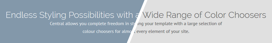
Your template comes with a host of Color Choosers and background image options allowing you total control of the look and feel of your site. Simply navigate to Extensions -> Template Manager -> [YourTemplate] to access the full range of easy to use styling options to give your template your very own look to suit your website.

- Details
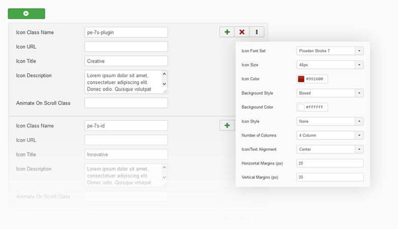
Our J51 Icons module extension allows you to quickly and easily place a set of icons in a module position along with a caption title and some text for each. You can choose from either the Font Awesome or 7Stroke icons sets combining in a massive 700+ scalable vector icons to choose from.
The module is fully responsive so you can be assured that your icon cards will fit perfect within all screen sizes. We have also included plenty of styling options, giving you ample control over how your icons will be displayed.
- Details
Lorem ipsum dolor sit amet, consectetur adipiscing elit. Nam sapien risus, blandit at fringilla ac, varius sed dolor. Donec augue lacus, vulputate sed consectetur facilisis, interdum pharetra ligula. Nulla suscipit erat nibh, ut porttitor nisl dapibus eu.
Phasellus porta eros vel lacus euismod consequat. Phasellus eleifend, nibh non feugiat hendrerit, lacus enim adipiscing eros, a pharetra erat neque eget est. Quisque vitae aliquet urna. Integer suscipit lectus eu enim porttitor fringilla. Ut blandit, urna in auctor euismod, arcu eros pharetra metus, a porta purus libero a nibh. Nam eget urna pellentesque nisl ultrices dapibus. Mauris accumsan vehicula nisl, sed tempus mauris facilisis eu. Donec a iaculis nisi, quis malesuada justo.
- Details
It has become common knowledge that every day the number of mobile devices used to view your site grows. Responsive design gives your site the power to provide an optimal viewing experience across a wide range of devices from a mobile phone to a desktop computer monitor.
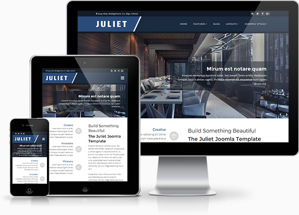 So how does it work? With the use of media queries different CSS style rules are loaded depending on characteristics of the device your site is been viewed with, most commonly the width of your browser. With each set of rules your site will be styled to best display on the matching device.
At Joomla51 we have embraced this new trend in website design and implemented responsive design to all our new releases, resolving any problems assoiciated with how your site will display on smaller resolution screens. To view how your template will respond to each screen resolution simply resize your browser window, as you reduce the width of your browser the template will react accordingly, altering its layout and style to best accomodate the site content within the available viewing area.
Alongside its responsive design, the template features a number of options within its parameters allowing you control over what content is displayed on smaller mobile devices. From your Joomla administration navigate to Extensions -> Template Manager -> J51_[YourTemplate] -> Responsive Options, here you will find a number of toggle switches to turn on/off each set of modules. If there is a situation where you would sooner your site to display the same on all devices then not to worry as we have added an option here to do that to (“,).
- Details
Imagehover.io is a library we created offering 44 unique image hover effects. Finally we have created a module which allows you to easily implement these effects within Joomla. This stylish gallery extension is an ideal solution to showcase site content in to attractive image boxes which can then be linked to a URL of your choice.
For those of you who are familiar with Joomla51 templates and have used our popular GridGallery module will find the Imagehover Gallery to be very similar with the exception that the Imagehover Gallery module sets the images in to a chosen number of columns rather fixed widths. This makes the Imagehover Gallery perfect when designing for multiple screens sizes and browser widths. Easily add title and description text for each image using the corresponding fields. Responsive options allow you to easily set the number of columns to display depending on the device it is been viewed on. Multiple color choosers allow you to style the different elements of boxes to your own taste making this module highly flexible, versatile and the perfect option when showcasing your images.